Search for templates for newsletter emails and you get galleries: page after page of thumbnails, each one a picture of someone else’s newsletter. The picture is the easy part. What you need is the order of the blocks, what goes in each one, and a way to rebuild that order inside the email tool you already use.
Why a Newsletter Template Is a Block Order, Not a Picture
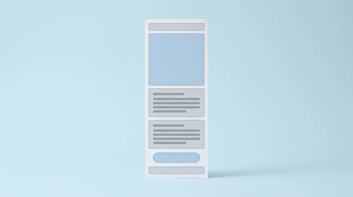
A newsletter template is a fixed order of blocks, from the sender line down to the footer, that you reuse for every issue. Email templates are usually built 600px wide, a width Klaviyo’s help center calls the industry standard (Klaviyo Help: Optimal email template width reference). Inside that narrow column, order matters more than decoration.
So why do so many template pages miss the point? Because they sell the look. A thumbnail can’t tell you why the call-to-action sits below the first story, or why the footer needs a postal address. Copy the picture without the reasons and the next issue drifts.
This guide takes the other route. It gives you seven newsletter templates written as block orders, each with what to put in every block and who the layout suits. Then it shows how to rebuild a layout in Kit, MailerLite or beehiiv, three tools we opened on the same day, and ends with a checklist to run before you send.
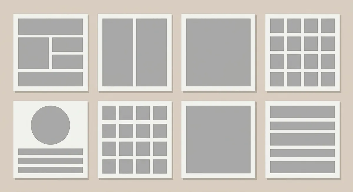
We are not a template shop, and nothing here is a download. Every layout below is a written structure you can rebuild in any editor in a few minutes.
Key Takeaways
Every commercial newsletter template needs a postal address and an unsubscribe option in the footer: the FTC says each email that breaks the CAN-SPAM Act can cost up to $53,088 (FTC CAN-SPAM Act Compliance Guide). Pick one of the seven layouts below, build it once at 600px, save it as a template in your email tool, and send a test to yourself before every issue.
What a Newsletter Template Is, and What Every Template Needs
Every email newsletter template, from a plain letter to a product roundup, shares the same six blocks, and US law fixes two of them: the FTC’s guide says “Your message must include your valid physical postal address,” and it must explain how to opt out (FTC CAN-SPAM Act Compliance Guide). The other four blocks are about getting the email opened and read.
Here are the six, in order:
| Block | What goes in it | Why it matters |
|---|---|---|
| Sender name | A person or brand name readers recognize | It is the first thing people see in the inbox |
| Subject line and preview text | A specific promise plus one supporting line | Preview text is the line after the subject in most inboxes |
| Header | Logo or newsletter name, issue date or number | Tells readers which newsletter this is at a glance |
| Content area | The stories, links or updates for this issue | This is the block that changes every time |
| Call to action | One button or link with a clear verb | Gives the reader one next step |
| Footer | Postal address, unsubscribe link, why they are receiving it | Required for commercial email in the US |
What does the FTC count as commercial? More than you might think. Its guide says the law covers “all commercial messages,” and “The law makes no exception for business-to-business email.” A company update that promotes a new product line counts. So the footer is not optional decoration; it belongs in the template itself, so nobody forgets it on a busy Friday.
Preview text deserves its own line in your template. Kit’s help center describes it as text that “gives your subscribers a sneak peek of what your Broadcast is about” (Kit Help: Creating, sending, and publishing Broadcasts). Leave it empty and the inbox has to guess, usually by showing the first words of your email; if those words are a “View in browser” line, that becomes your preview.
Email Templates vs Printed Newsletter Templates
Printed newsletter templates, the kind made for Word, Publisher or PowerPoint, are fixed pages with columns, while an email template is a single column that has to reflow on a phone; MailerLite’s help center notes that responsive email relies on media queries and “not all of them support media queries on mobile” (MailerLite Help: How to build a responsive newsletter). That is the core difference, and it is why you can’t paste one into the other.
A printed layout puts three columns side by side, wraps text around photos and runs a masthead across the top of the page. On a desktop email client that might survive. On a phone, the columns either shrink to unreadable text or stack in an order you didn’t choose.
Can you send a Word or PDF newsletter by email? You can attach it, but then readers must open a file, and the content is invisible in the inbox preview. Pasting a designed page as one big image is worse: screen readers see nothing, and the text can’t be searched or clicked. Gmail’s sender guidelines also say not to use HTML and CSS to hide content in your messages (Gmail Help: Email sender guidelines). A real email layout keeps text as text.
The good news is that the structure carries over. A printed “old school” newsletter with a masthead, a lead story, short news items and a calendar becomes a perfectly good email if you stack those parts in one column. If you want ready-made files for Google Docs, Word or Canva instead, our guide to newsletter templates for Google Docs, Word and Canva covers where to get them and how each app handles export.
Layout 1: The Text-Only Letter
The text-only letter is a newsletter template with no images and almost no styling: a greeting, a few paragraphs and a sign-off, as if a friend wrote it. Kit ships a “Text only” email template, and it is the one we picked for both our test broadcast and our welcome sequence on October 20, 2026.
| Block | What goes in it |
|---|---|
| Header | Newsletter name in plain text, or nothing at all |
| Greeting | First name if you have it, “Hi there” if you don’t |
| Body | Three to six short paragraphs on one topic |
| Call to action | One text link inside a sentence |
| Sign-off | Your name, maybe one line about you |
| Footer | Postal address and unsubscribe link |
Who is it for? Writers, consultants, coaches and anyone whose readers subscribed for a voice rather than a design. It is also the fastest layout to produce every week, because there is nothing to resize.
In our own setup, the Kit “Text only” template took a subject line and one paragraph, and the test email arrived looking like a normal personal message. That plain look is the point. It reads like a letter, not a flyer.
One related idea: every HTML email also has a plain-text version. MailerLite’s help center says “The plain-text version of your campaign is automatically generated whenever you create a campaign,” for inboxes that can’t show HTML (MailerLite Help: How to edit the plain-text version of a campaign). A text-only letter is the layout where the two versions look almost the same.
Layout 2: The Weekly Digest of Links
A weekly digest is a newsletter template built around a short list of links, each with a one- or two-sentence summary, and it is the layout behind most curated weekly newsletters. beehiiv’s help center mentions publications that use “multiple formats, like weekday roundups and weekend deep dives” as a reason to save more than one template (beehiiv Help: Creating and using newsletter templates).
| Block | What goes in it |
|---|---|
| Header | Newsletter name and issue number |
| Intro | Two or three sentences: what this week was about |
| Top pick | One link with a longer summary and why it matters |
| Link list | Four to six links, each with a short title line and one sentence |
| Quick note | A tip, a reader question or a short opinion |
| Call to action | “Forward this to a friend” or a subscribe link for new readers |
| Footer | Postal address and unsubscribe link |
How many links is too many? There is no official number. In our judgment, if a reader can’t finish the email over one coffee, cut the list. A digest that runs long trains readers to skim, and skimmers stop clicking.
Two small habits keep weekly newsletter templates readable. Write each summary so it makes sense without the link, and put the source name before the link text. Readers decide in a second whether a link is worth a tap.
Layout 3: The Monthly Update With Sections
A monthly newsletter template groups an issue into fixed, labeled sections, such as news, a feature, events and a short “from the team” note, so readers can jump to the part they care about. Fixed sections also make monthly and quarterly newsletter templates easier to produce, because each month you only fill the boxes.
| Block | What goes in it |
|---|---|
| Header | Newsletter name, month and year |
| In this issue | Three to five section names as anchor-style links or a short list |
| Lead story | The month’s main news, three or four paragraphs, one image |
| Section 2 | Updates, launches or results |
| Section 3 | Upcoming events or dates, as a short list |
| Section 4 | A recurring feature: a tip, a customer story, a reader question |
| Call to action | One action tied to the lead story |
| Footer | Postal address, unsubscribe link, link to past issues |
Why name the sections the same way every month? Because readers learn the pattern. After two or three issues, they know the events list is near the bottom and scroll straight to it.
This layout also adapts well to seasonal versions. A January issue can open with plans for the year; an October issue can carry a Halloween event in the dates section. You keep the structure and change the details, which is exactly what a template is for.
Keep the “in this issue” list short. If you need more than five sections, the issue is probably two newsletters, and a quarterly roundup might serve readers better than a long monthly one.
Layout 4: The Company or Team Update
An internal company newsletter template is a short, scannable layout for employees: the top news first, then team updates, people news and one action, because staff read it between other work. Gmail’s stricter bulk-sender rules, by the way, start at 5,000 messages a day to Gmail accounts, a level that a large company list can reach (Gmail Help: Email sender guidelines).
| Block | What goes in it |
|---|---|
| Header | Company or team name and date |
| Top story | One change that affects everyone, in plain words |
| Team updates | Two or three short items from different teams |
| People | New hires, anniversaries, a shout-out |
| Dates | Deadlines, all-hands, holidays |
| Action | One thing staff should do this week |
Does an internal newsletter need an unsubscribe link? Rules for workplace email depend on your company and your tool, so check with whoever owns internal communications. For a public list, the footer rules above always apply. A dedicated guide to company and team newsletter templates is on our list for this series.
Layout 5: The School or Classroom Newsletter
A school or classroom newsletter template speaks to parents: what happened, what is coming, and what families need to do, in that order. Most readers open emails on mobile, as beehiiv’s template guide puts it, so a parent reading in a school pickup line should be able to find the dates in seconds (beehiiv Help: Creating and using newsletter templates).
| Block | What goes in it |
|---|---|
| Header | Class or school name, week or month |
| Teacher’s note | Two or three warm sentences |
| What we learned | Short summary per subject |
| Coming up | Dates, field trips, tests, events |
| Reminders | Forms, supplies, payments |
| How to reach me | Email or office hours |
What about student photos and names? Follow your school’s policy and get the consent it requires from families before any child appears in a newsletter. When in doubt, use classroom photos without faces. We will cover school and classroom newsletter templates in more depth in a separate guide.
Layouts 6 and 7: The Seasonal Announcement and the Product or Listing Roundup
The last two layouts are the most promotional: a seasonal announcement pushes one event or offer, and a product or listing roundup shows several items with a photo, a line and a link each. Because both are clearly commercial, the FTC’s footer rules matter most here, and its guide adds that the subject line “must accurately reflect the content of the message” (FTC CAN-SPAM Act Compliance Guide).
Layout 6: the seasonal announcement
| Block | What goes in it |
|---|---|
| Header | Brand name |
| Hero | One image and a one-line headline for the holiday, sale or event |
| Details | Dates, place or terms in a short list |
| Call to action | One large button |
| Secondary | One related link, such as last year’s recap |
| Footer | Postal address and unsubscribe link |
Which season or event deserves its own email? Only the ones with a date and an action attached. This is the template for holiday newsletters, Christmas or Thanksgiving offers, spring events and back-to-school notices. Keep one goal per email. A seasonal email with three buttons usually gets fewer clicks on each.
Layout 7: the product or listing roundup
| Block | What goes in it |
|---|---|
| Header | Brand name and a theme for the roundup |
| Intro | One or two sentences on why these items, now |
| Item cards | Three to six items: image, name, one line, price or key detail, link |
| Featured item | Optional: one item with more space |
| Call to action | “See all” link to the full catalog or listings page |
| Footer | Postal address and unsubscribe link |
Product newsletter templates for shops and listing roundups for real estate agents share this shape. Give every image alt text that names the item, so the email still makes sense when images are off. If any price in the email can change, say where the current price lives. A real estate version of this layout will get its own guide.
How to Rebuild a Layout in Kit, MailerLite or beehiiv
You rebuild any of the seven layouts the same way in all three tools: start from the plainest built-in template, add your blocks in order, save it as your own template, and send a test to yourself. We opened Kit, MailerLite and beehiiv on October 20, 2026, all on no-card trials, and sent a test email from each one only to our own inbox. Not sure which of the three to pick? Our side-by-side comparison of beehiiv, Kit and MailerLite runs all three through the same seven tasks.
Kit
Kit’s help center says “Email templates in Kit come in three flavors: starting point, classic, and HTML,” and adds “Wherever possible, we recommend using a starting point template” because you can edit every part of it while you write (Kit Help: Starting point, classic, and HTML email templates). Classic templates only let you edit the default content section, and HTML templates are for people who code their own.
Our path was Broadcasts, then New Broadcast, then the “Text only” template, a subject line and one paragraph, then Preview and Send test email. The test box said: “Send a test email to see how it will look in your email client.” When we built the welcome sequence, we used the same “Text only” template, and the subscribe form came from a form template called “Charlotte.”
To keep a layout, Kit lets you save a Broadcast as a template from the sidebar, as a new template or as an update to the one you used (Kit Help: Creating, sending, and publishing Broadcasts). One catch: “Starting point templates cannot be set as your default email template at this time.” Also, if you plan to send a welcome email from a template, Kit’s Free plan article says “Visual automations and sequences stop running while you’re on the Free plan” (Kit Help: The Kit Free plan). Broadcasts stay unlimited on the free plan. Our hands-on Kit setup, from signup form to test send has the full walkthrough.
MailerLite
MailerLite’s help center says “Pre-designed templates are a paid feature available on the Comfort and Power plans,” and that the Template gallery lets you “choose from over 50 pre-designed email templates” filtered by category (MailerLite Help: Everything about email templates). Its pricing comparison table marks newsletter templates as “Limited” on the Free plan and includes “Create your own template” on every plan (MailerLite pricing). On a free account, plan to build most of your layout yourself.
During our 14-day trial, we picked a campaign template from the “Simple emails” group, replaced the heading and first paragraph, and sent a test. The test dialog warned: “Spam placement is common for test emails and doesn’t reflect your actual campaign health.” Then we tried the automation template “Simple welcome email.” It came with placeholder buttons, and the email step showed “Add missing URLs to buttons.” A template is only finished when every button has a real link.
Two more facts from the same help article change how you work. To save a layout, open Actions in the editor and choose Save as template; it then lives under My templates. And you can’t swap the template of a campaign once you have started writing its content, so pick the layout before you write. MailerLite also says newsletters built in its Drag & drop and Simple editors are “automatically responsive.” For everything else we saw on the free plan, see what a free MailerLite account let us build.
beehiiv
beehiiv’s template article lists “Plan: All Plans,” so templates are not a paid extra there (beehiiv Help: Creating and using newsletter templates). You open the Post template library from the arrow next to New, choose Template post, and pick a blank draft, a Quick start template or one of your own.
We wrote our test post in beehiiv’s post editor and used Send test email from the Review step. The dialog said: “It only goes to the addresses you choose, not your subscribers.” The preview showed the sender as the publication name with a beehiiv mail address, which is worth knowing before you design a header around your own domain.
Like Kit, beehiiv lets you save any post, draft or published, as a template. It also lets you attach a default audience to a template, so a premium digest always goes to paid subscribers. Its best-practice list starts with “Keep layout structure simple” and “Use placeholders thoughtfully,” which matches the block-order approach in this guide. Our notes on the beehiiv free plan, Pro trial and phone check cover the rest of the app.
Using another email tool, such as Mailchimp? The same four steps work in any drag-and-drop editor: plainest template, blocks in order, save, test. If you are thinking of switching, our hands-on look at email tools that can replace Mailchimp compares their editors and free plans side by side.
Starting with a welcome email
If your first template is a welcome email rather than a regular issue, start from Layout 1. A welcome email is a letter: who you are, what readers will get and how often, and one link. Our guide to welcome email examples and a three-email series walks through the full sequence.
Before You Send: A Template Checklist
Run every new newsletter template through a short checklist before the first real send; the one step you can’t skip is a test email to yourself, because, as MailerLite’s own dialog warned us, “Spam placement is common for test emails and doesn’t reflect your actual campaign health.” A test shows layout problems, not deliverability.
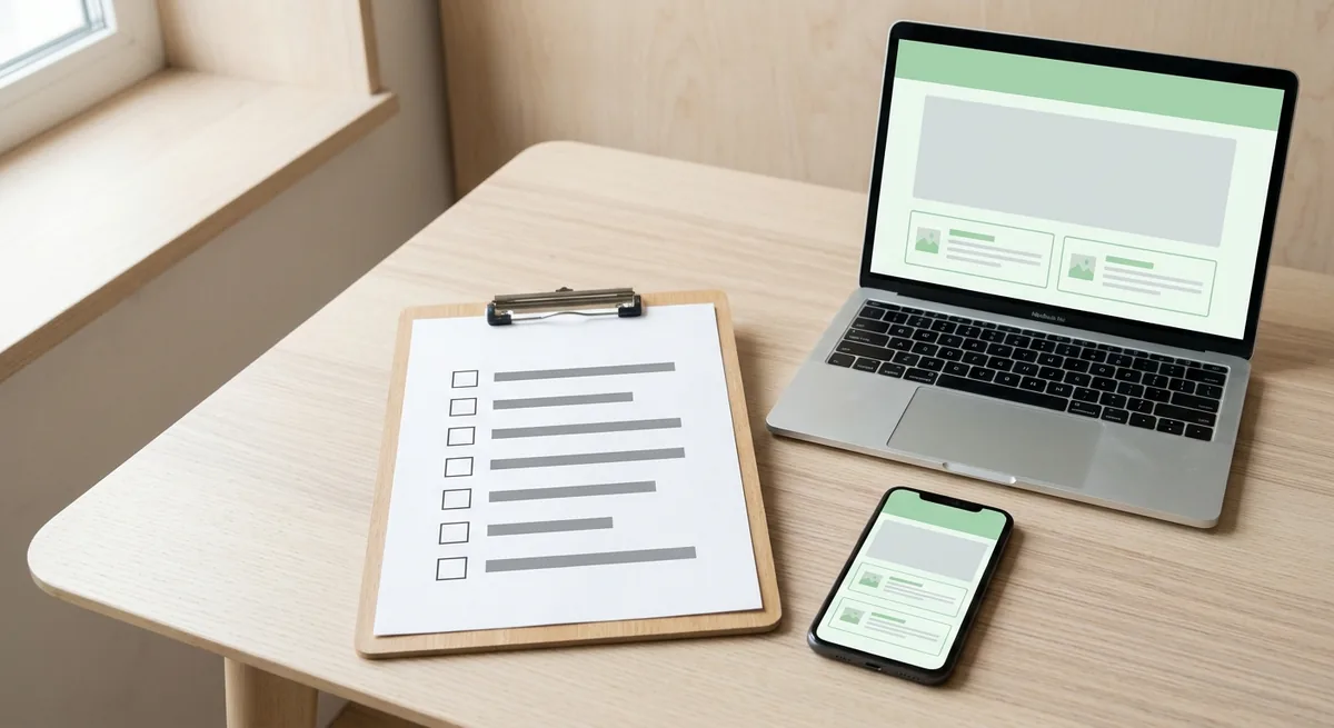
- Width. Build at 600px unless you have a reason not to. Klaviyo’s help center notes “The default width in Klaviyo’s drag-and-drop email editor is 600px,” and wider layouts can look skewed on phones (Klaviyo Help).
- Mobile preview. Kit, MailerLite and beehiiv all offer a mobile preview. Check that columns stack in a sensible order and buttons are easy to tap.
- Dark mode. MailerLite’s help center lists Apple Mail, the Gmail app and Outlook among the clients that offer dark mode, and suggests high contrast and avoiding thin fonts (MailerLite Help). Check that your logo still shows on a dark background.
- Alt text. Give every image a short description. Kit asks for alt text on post thumbnails “to help people using screen readers understand your image.”
- Subject and preview text. Fill both, and make the subject match the content.
- Footer. Postal address and an unsubscribe link, every time. The FTC says you must honor opt-out requests within 10 business days (FTC guide).
- One-click unsubscribe. If you send more than 5,000 messages a day to Gmail accounts, Google’s sender guidelines require one-click unsubscribe for marketing messages (Gmail Help). Most newsletter platforms handle this for you; confirm it in your tool’s settings.
- Links and buttons. Click every link in the test email. A placeholder button that still points nowhere is the template bug we actually ran into.
- Test email. Send it to yourself, read it on your phone, then send.
Why does the test email matter so much? Because some things only break in the inbox. MailerLite’s automation test dialog told us “Test emails have limited features and Unsubscribe, Forward and Preference Center links will not work on them,” so don’t panic if those links fail in a test.
Picking Your First Newsletter Template: Your Next Step
Pick the layout that matches what you already have to say, not the one with the nicest thumbnail; in our test, the plainest template, Kit’s “Text only,” was also the fastest to send. Start simple, send three issues, and only then add sections.
| Your situation | Start with |
|---|---|
| You write essays or advice | Layout 1: the text-only letter |
| You share links you find every week | Layout 2: the weekly digest |
| You run an organization with several kinds of news | Layout 3: the monthly update |
| You write for employees or a team | Layout 4: the company update |
| You write to parents | Layout 5: the school newsletter |
| You promote one event or offer | Layout 6: the seasonal announcement |
| You sell products or list properties | Layout 7: the product or listing roundup |
Still building the list itself? Read our checklist for starting a new email list first; a template matters most once someone is reading.
Whatever you pick, save it in your email tool as a named template, so issue two starts from issue one instead of from a blank page. That small habit is what turns a design into a newsletter people recognize.
References
- FTC: CAN-SPAM Act: A Compliance Guide for Business
- Gmail Help: Email sender guidelines
- Klaviyo Help: Optimal email template width reference
- Kit Help: Starting point, classic, and HTML email templates: which should you use?
- Kit Help: Creating, sending, and publishing Broadcasts
- Kit Help: The Kit Free plan
- MailerLite Help: Everything about email templates
- MailerLite: Pricing
- MailerLite Help: How to build a responsive newsletter
- MailerLite Help: How to edit the plain-text version of a campaign
- beehiiv Help: Creating and using newsletter templates